CSS3 - Transitions, Transforms and Animations
Introduction
What is CSS3?
CSS comes from Cascading Style Sheets and 3 means the last version of the CSS language. This version has introduced new features like transitions, animations, gradients, rounded corners or layout characteristics like multi-columns, flexible box or grid layouts.
Let's talk about three of them: transitions, transforms and animations.
Transitions
Transitions happens when elements transition from one state to another. Actually we can alter their appearance by changing the color when you hover over a link or by changing the size when an images comes into focus.
There are 4 properties that you have to keep in mind when using a transition:
- transition-property (when you want to change the size, color, position etc)
- transition-duration ( describes how long should each transition last)
- transition-timing (when you want for example a smooth transition, it depends on timing value)
- transition-delay (how long should the wait be before the transition signal?)
To be sure that you will get the desired transition, you have to follow the steps:
- define your element
- choose elements for transitions
- define new values - this step has to be combined with a pseudo-class (hover, focus, active)
The following example highlights the transition effect applied on a box, In the left part is the normal box and in the right part can be seen the transition effect which changes the border color of the box.
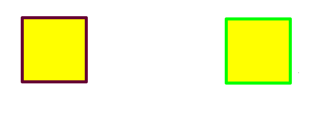
transition effect applied on a box
The corresponding code:
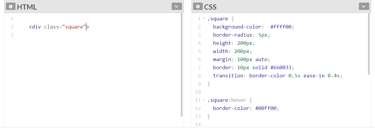
The HTML and CSS code for this example
Transforms
The transforms are one more way to modify the look of a page. These are often used with state changes and requires browser prefixes. The elements can be changed in 2D or 3D manner. The options used to modify the effects applied on elements are: translate, rotate, scale, skew and matrix.
Translate
The translate option transform: translate(x,y) has 2 parameters called x and y. Depending on x and y the element can be moved to the left and right or up and down.
Rotate
The rotating option transform: rotate(xdeg) spinning an element a certain number of degrees.
Scale
The scale option transform: scale(x) modify the dimensions of the elements.
Skew
The skew option transform: skew(xdeg) the element a certain number of degrees along the x and y axis.
The following example shows the difference between the transform properties used on a box of 110 x 110 pixels:
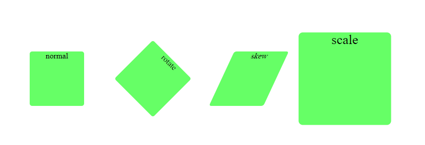
Transform properties effect
Here is the complete code:
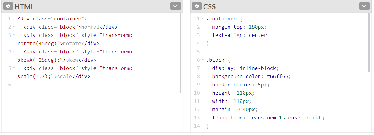
The HTML and CSS code for this example
Animations
To use a little bit of animations we need transitions.
When using animations,there are two important components:
- @keyframe - it sets how the animation will look like in every stage between the starting and ending time
- animation properties - define how will be the animation by assigning the @keyframes to a particular CSS element
There are some so called sub-properties of animations which helps you to configure the duration,timing and more other details about the animation:
- animation-name: sets the name of the @keyframe
- animation-duration: configures the length of the animation
- animation-timing-function: establish how the animation transition behave through keyframes
- animation- delay: is the time between the loading of the element and the beginning of the animation
- animation-iteration-count: configures how many times the animation will repeat
- animation-direction: specify how the animation will behave,it will play reverse,forward or it will alternate
- animation-fill-mode: stipulate whether the animation will be visible after or before the actual play of the animation
- animation-play-state: gives you the possibility to resume or pause the animation
This video explain better the animation procedure. It presents two types of animation, one applied on a text and the other one applied on a drop down menu. Three different animation styles are presented.
The source code from the video can be accessed at: https://codepen.io/mihat/pen/LMKXXY
Creative Commons Licence

This work is licensed under a Creative Commons Attribution-NonCommercial-ShareAlike 4.0 International License.