The purpose of this lesson is to teach students about the three …
The purpose of this lesson is to teach students about the three dimensional Cartesian coordinate system. It is important for structural engineers to be confident graphing in 3D in order to be able to describe locations in space to fellow engineers.
Open Resources for Community College Algebra (ORCCA) is an open-source, openly-licensed textbook …
Open Resources for Community College Algebra (ORCCA) is an open-source, openly-licensed textbook package (eBook, print, and online homework) for basic and intermediate algebra. At Portland Community College, Part 1 is used in MTH 60, Part 2 is used in MTH 65, and Part 3 is used in MTH 95.
In this video lesson, students will learn about linear programming (LP) and …
In this video lesson, students will learn about linear programming (LP) and will solve an LP problem using the graphical method. Its focus is on the famous "Stigler's diet" problem posed by the 1982 Nobel Laureate in economics, George Stigler. Based on his problem, students will formulate their own diet problem and solve it using the graphical method. The prerequisites to this lesson are basic algebra and geometry. The materials needed for the in-class activities include graphing paper and pencil. This lesson can be completed in one class of approximately one hour. If the teacher would like to cover the simplex algorithm by George Dantzig as an alternative solution method, an additional whole class period is suggested.
Student groups use a "real" 3D coordinate system to plot points in …
Student groups use a "real" 3D coordinate system to plot points in space. Made from balsa wood or wooden dowels, the system has three axes at right angles and a plane (the XY plane) that can slide up and down the Z axis. Students are given several coordinates and asked to find these points in space. Then they find the coordinates of the eight corners of a box/cube with given dimensions.
Using Avida-ED freeware, students control a few factors in an environment populated …
Using Avida-ED freeware, students control a few factors in an environment populated with digital organisms, and then compare how changing these factors affects population growth. They experiment by altering the environment size (similar to what is called carrying capacity, the maximum population size that an environment can normally sustain), the initial organism gestation rate, and the availability of resources. How systems function often depends on many different factors. By altering these factors one at a time, and observing the results, students are able to clearly see the effect of each one.
Students observe four different classroom setups with objects in motion (using toy …
Students observe four different classroom setups with objects in motion (using toy cars, a ball on an incline, and a dynamics cart). At the first observation of each scenario, students sketch predicted position vs. time and velocity vs. time graphs. Then the classroom scenarios are conducted again with a motion detector and accompanying tools to produce position vs. time and velocity vs. time graphs for each scenario. Students compare their predictions with the graphs generated by technology and discuss their findings. This lesson requires assorted classroom supplies, as well as motion detector technology.
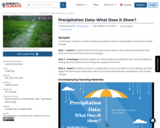
SYNOPSIS: In this lesson, students use New Jersey precipitation data to create …
SYNOPSIS: In this lesson, students use New Jersey precipitation data to create graphs and discuss climate change.
SCIENTIST NOTES: This lesson has students working on their data analysis skills through the use of graphs which help students to interpret New Jersey’s precipitation data and how it relates to climate change. A class discussion encourages students to think critically about the raw data. Students then work independently to graph the precipitation over time, finding a line of best fit and the equation for the line. This is followed by a discussion of the relationship between time and precipitation. Data forecasting is touched upon when students are asked to think about what data they would need next and what is predictable about the data. Students then choose one of two choices that allow them to compare and contrast visually represented data. This is a well-rounded lesson that relays the information of climate change through graphing and data analysis and is recommended for teaching.
POSITIVES: -This lesson can be used independently to practice application of math and reasoning skills or as ang point for longer research into data displays. -Students can use graph paper or any digital platform schools and teachers are already familiar with. -Students are given voice and choice in this lesson. -Students learn to apply math skills to current situations to explore and explain relationships in nature. -Students defend their chosen quantities and levels of accuracy in displaying data.
ADDITIONAL PREREQUISITES: -Students should have some basic understanding of graphing, plotting points, and the relationship between x & y-axes. -Students should have a basic idea of an equation of a line, line of best fit, and slope. -Students should have a basic understanding of other types and purposes of graphs and charts.
DIFFERENTIATION: -Teachers can adjust the degree of difficulty based on the math level of each class. -If using a digital graphing platform, teachers and students can manipulate data to explore related questions. -Teachers can explore deeper the purpose of different kinds of graphs in highlighting different parts of the same data set. -Teachers can bring in a variety of graphs from scientific journals or magazines, such as National Geographic, as instructional tools. -Teachers can extend this project to have students or classes graph the relationship between precipitation and time for all 50 states. Students can then display their graphs and conclusions. Teachers can moderate discussions comparing and contrasting various states and regions or make a conclusion as a whole. -Using the same website resources, students can explore the average maximum and minimum temperature table. They can explore the relationship between temperature and precipitation using various graphs. Teachers can then use this to discuss causation and/or correlation. -Teachers can use the lesson to introduce causation and correlation, asking students if there is a correlation between precipitation and climate change.
How is psychology influenced by the digitalization of almost everything? What can …
How is psychology influenced by the digitalization of almost everything? What can frequent digital measurements and novel statistical techniques mean for 21st century psychology?
In this tutorial students conduct both an N=1 time-series case study and experiment, measuring some aspects of their daily life, such as mood, food intake, social activities, exercise, attention, alertness, sleep, or anything else they like. The experiment will result in (1) a linear graph depicting the effect of the chosen intervention through time and (2) a network depicting relationships between the chosen variables through time.
With this personal case study and experiment students get some insights into the new possibilities of frequently repeated measurements for studying (individual) human behavior.
There is a description of the lesson that includes learning outcomes. This …
There is a description of the lesson that includes learning outcomes. This activity includes instructor guides, learning outcomes, student handouts, graphic organizers, and answer keys. There are two worksheets, one targeted to math students and the other targeted to biology/science students. Each worksheet is complemented with corresponding answer keys for faculty. There is background information, links to additional/supplemental information, teaching tips and a breakdown of the vocabulary differences between the math and biology classroom provided in the answer key handouts. Also, a link is provided to an original paper (Journal of Bacteriology, 1935) where bacterial growth rates were determined experimentally.
In this activity students will use linear regression to analyze real data …
In this activity students will use linear regression to analyze real data on vector-borne diseases such as Malaria, Zika, and LaCrosse Virus. Students will explore how environmental factors such as climate change or population density influence the transmission of these diseases. The activities are designed for face-to-face instruction and may be adapted for an online classroom. This material is based upon work supported by the National Science Foundation under Grant No. 1919613. Any opinions, findings, and conclusions or recommendations expressed in this material are those of the author(s) and do not necessarily reflect the views of the National Science Foundation.
In this activity, students will perform an experiment utilizing dialysis tubing to …
In this activity, students will perform an experiment utilizing dialysis tubing to create cellular models to demonstrate the linear relationship between cell weight and time in varying tonicities. Videos and data sets (of faculty results) are provided for maximum flexibility in delivery methods.
Why are Cells Small? was developed as part of an effort by …
Why are Cells Small? was developed as part of an effort by the Quantitative Biology at Community Colleges group to provide materials that incorporate mathematical concepts into biology courses. The activity was designed for a non-majors biology course, and maps to Chapter 4 of the OpenStax Biology 2e textbook. This activity could also be used in a mathematics course as a biologically relevant example.
After completing this module students should be able to:
- Explain the relationship of surface area to volume - Describe the importance of a large surface area to volume ratio in the context of a living cell - Calculate surface area of cubes and spheres - Calculate volume of cubes and spheres - Express two values as a ratio - Enter data into a table - Interpret Tables - Create a graph - Describe the axis labels on graphs - Interpret graphs This material is based upon work supported by the National Science Foundation under Grant No. 1919613. Any opinions, findings, and conclusions or recommendations expressed in this material are those of the author(s) and do not necessarily reflect the views of the National Science Foundation.
This lesson plan has a guide to working in groups and with …
This lesson plan has a guide to working in groups and with peers in a positive manner. This also has background of the importance of knowing and understanding a stories outcome and mentions how to make a bar and picture graph. One the second day, for evaluation students will be in groups making a short story and creating a graph in their story. Brain break activities are also included to encourage physical movement.
Many of today's popular sports are based around the use of balls, …
Many of today's popular sports are based around the use of balls, yet none of the balls are completely alike. In fact, they are all designed with specific characteristics in mind and are quite varied. Students investigate different balls' abilities to bounce and represent the data they collect graphically.
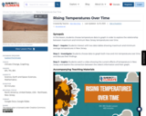
SYNOPSIS: In this lesson, students choose temperature data to graph in order …
SYNOPSIS: In this lesson, students choose temperature data to graph in order to explore the relationship between maximum and minimum New Jersey temperatures over time.
SCIENTIST NOTES: This lesson encourages students to create a visual representation of an available climate dataset. A class discussion walks students through the data and how to navigate through the available information. Students are provided instructions on how to create a graph and are allowed to choose which data they will visually represent. The Student Document introduces and invites students to conduct data analysis on their chosen dataset and encourages critical thinking skills. A short video and discussion questions help students relate current information back to their chosen datasets. This is an interactive lesson that incorporates data analysis with the current issue of climate change.
POSITIVES: -This lesson can be used in any math class. -Students are given voice and choice in this lesson. -Students learn to apply real-world data from a table into a comparable graph. -Students explore the connection between data, graphs, and current effects.
ADDITIONAL PREREQUISITES: -Students should have a basic understanding of average and how it is calculated. -Students should have a basic understanding of reading data tables. -Students should have a basic understanding of graphing and coordinate points expressed as (x, y). -Students should have a basic understanding of the relationship between the x- and y-axes.
DIFFERENTIATION: -Students’ communication and vocabulary can be simple or content-specific with math terminology. -Students can use their graph to make an infographic about temperature and climate change. Students can then present their infographic in class, in a school club, or in the community to raise awareness. -Students can find the line of best fit, find the equation of that line in y = mx + b form, and explain what that line shows about the relationship between average temperatures and time. -Students can use the same data and make different graphs (e.g., bar graph, pie chart, etc.). Students can explain how each graph emphasizes different parts of the same data and explain which graph is best in conveying a specific conclusion.
Students build and use a very basic Coulter electric sensing zone particle …
Students build and use a very basic Coulter electric sensing zone particle counter to count an unknown number of particles in a sample of "paint" to determine if enough particles per ml of "paint" exist to meet a quality standard. In a lab experiment, student teams each build an apparatus and circuit, set up data acquisition equipment, make a salt-soap solution, test liquid flow in the apparatus, take data, and make graphs to count particles.
This lesson on snails integrates Science, Language Arts, Technology and Math. Teacher …
This lesson on snails integrates Science, Language Arts, Technology and Math. Teacher will share a fictitious snail story with students. Students will complete a K-W-L chart on snails with the help of the internet. As a related activity, students will take a poll on snail preferences and graph it.
This learning sequence is anchored in the phenomena: Salmon populations in the …
This learning sequence is anchored in the phenomena: Salmon populations in the Pacific Northwest are declining.
Part of the job of Washington Department of Fish and Wildlife (WDFW) is to figure out why salmon populations are declining and create plans for how to help increase fish populations. Throughout this unit, students will engage with the phenomenon of Pacific salmon population decline as they explore salmonid species and discover how WDFW raises healthy fish in hatcheries.
Students will explore salmonid life cycles and discover patterns among life cycles of plants and animals who interact with salmon. Students will then learn what makes healthy habitats for salmon. They will evaluate solutions to the problems of salmon migration above and below dams and examine salmons’ role in a healthy river system. Students will embark on a virtual field trip (in person field trips also available) to a WDFW fish hatchery to learn about current practices in hatchery management and identify ways the hatchery meets the habitat needs of fish. Finally, students will be called to work as an engineering team and help develop a tool to support salmon recovery by working as conservation engineers.
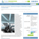
Students apply pre-requisite statistics knowledge and concepts learned in an associated lesson …
Students apply pre-requisite statistics knowledge and concepts learned in an associated lesson to a real-world state-of-the-art research problem that asks them to quantitatively analyze the effectiveness of different cracked steel repair methods. As if they are civil engineers, students statistically analyze and compare 12 sets of experimental data from seven research centers around the world using measurements of central tendency, five-number summaries, box-and-whisker plots and bar graphs. The data consists of the results from carbon-fiber-reinforced polymer patched and unpatched cracked steel specimens tested under the same stress conditions. Based on their findings, students determine the most effective cracked steel repair method, create a report, and present their results, conclusions and recommended methods to the class as if they were presenting to the mayor and city council. This activity and its associated lesson are suitable for use during the last six weeks of the AP Statistics course; see the topics and timing note for details.
This learning video presents an introduction to graph theory through two fun, …
This learning video presents an introduction to graph theory through two fun, puzzle-like problems: ''The Seven Bridges of Konigsberg'' and ''The Chinese Postman Problem''. Any high school student in a college-preparatory math class should be able to participate in this lesson. Materials needed include: pen and paper for the students; if possible, printed-out copies of the graphs and image that are used in the module; and a blackboard or equivalent. During this video lesson, students will learn graph theory by finding a route through a city/town/village without crossing the same path twice. They will also learn to determine the length of the shortest route that covers all the roads in a city/town/village. To achieve these two learning objectives, they will use nodes and arcs to create a graph and represent a real problem.
No restrictions on your remixing, redistributing, or making derivative works. Give credit to the author, as required.
Your remixing, redistributing, or making derivatives works comes with some restrictions, including how it is shared.
Your redistributing comes with some restrictions. Do not remix or make derivative works.
Most restrictive license type. Prohibits most uses, sharing, and any changes.
Copyrighted materials, available under Fair Use and the TEACH Act for US-based educators, or other custom arrangements. Go to the resource provider to see their individual restrictions.